A bar graph is a graph with rectangular bars. It is used to compare different categories. The most usual type of bar graph is vertical. One who is willing to learn more about the bar graph can refer to the following sections. On this page, we are providing the definition of a bar graph or column graph, solved example questions, and types of the bar graph.
Bar Graph Definition
A bar graph is a pictorial representation of grouped data in the form of horizontal or vertical rectangular bars, here the length of rectangular bars is equal to the measure of the data. The height of a rectangular bar totally depends on the numeric value it represents. The frequency distribution tables can be represented using bar charts which simplify the calculations and understanding of data.
Types of Bar Graphs or Column Graphs
In general, bar graphs can be horizontal or vertical rectangular bars. The main feature of a bar chart is its length or height. If the height of any bar graph is more, then the values are greater than the given data. In any bar graph, bars represent frequencies of distinctive values of a variable. The number of values on the x-axis of a bar graph and the y-axis of a column graph is known as the scale. The two types of bar graphs are the vertical bar graph and the horizontal bar graph. Apart from vertical, horizontal bar graphs, the other two types are grouped bar graphs, stacked bar graphs.
- Vertical Bar Graph: If the given data is represented vertically in a graph with the help of bars, where the bars denote the measure of data such graphs are called the vertical bar graphs.
- Horizontal Bar Graph: If the grouped data is represented horizontally in a graph with the help of bars, then those graphs are called the horizontal bar graphs.
- Grouped Bar Graph: It is used to represent the discrete value for more than one object. Here, the number of instances are combined together into a single bar. It is also known as the clustered graph.
- Stacked Bar Graph: It divides an aggregate into different parts. A stacked bar graph is also known as the composite bar graph.
How to draw Bar Graph or Column Graph?
- On a graph paper, draw two lines that represent x-axis (OX), y-axis (OY).
- Mark the points at equal intervals along the x-axis, also mention the names of data items whose values are plotted.
- Select a suitable scale. Find the heights of the bar for the given values.
- Mark off these heights or lengths parallel to the y-axis from the points taken in Step 2.
- Draw the bars of equal width for the heights marks in the above step along the x-axis. Those bars represent the numerical data.
Column Graph Solved example Questions
Example 1.
The annual earnings of a firm during the 8 consecutive years are given below:
| Year | 2010-2011 | 2011-2012 | 2012-2013 | 2013-2014 | 2014-2015 | 205-2016 | 2016-2017 | 2017-2018 |
|---|---|---|---|---|---|---|---|---|
| Annual Earnings (in dollars) | 150 | 120 | 170 | 180 | 160 | 190 | 200 | 205 |
Draw a bar graph representing the above data.
Solution:
Given that,
The annual earnings of a firm over the 8 consecutive years.
On a graph paper, draw a horizontal line OX and a vertical line OY, representing the x-axis and the y-axis respectively.
Take years along the x-axis at equal gaps.
Choose 1 small division = 10 dollars
Then, the heights of the bars are:
Annual income in 2010-11 = (1/10 * 150) = 15 small divisions
Annual income in 2011-12 = (1/10 * 120) = 12 small divisions
Annual income in 2012-13 = (1/10 * 170) = 17 small divisions
Annual income in 2013-14 = (1/10 * 180) = 18 small divisions
Annual income in 2014-15 = (1/10 * 160) = 16 small divisions
Annual income in 2015-16 = (1/10 * 190) = 19 small divisions
Annual income in 2016-17 = (1/10 * 200) = 20 small divisions
Annual income in 2017-18 = (1/10 * 205) = 20.5 small divisions
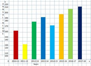
Bar graph showing firm annual income during eight consecutive years
At the points marked in Step 2, draw bars of equal width and of heights calculated.
Example 2.
In a firm of 500 employees, the percentage of monthly salary saved by each employee is given in the following table. Represent it using a bar graph.
| Number of Employees | 100 | 50 | 73 | 150 | 60 | 67 |
|---|---|---|---|---|---|---|
| Savings in Percentages | 20 | 30 | 50 | 60 | 70 | 80 |
Solution:
Given that,
The savings percentage of 500 employees in a firm.
Draw two lines OX, OY on graph paper.
Take savings along the x-axis, number of employees along the y-axis.
Choose 1 small division = 10 units on y-axis.
Then, the heights of the bars are:
The number of employees who are saving 20% of salary is (1/10 * 100) = 10 small divisions
The number of employees who are saving 30% of salary is (1/10 * 50) = 5 small divisions
The number of employees who are saving 50% of salary is (1/10 * 73) = 7.3 small divisions
The number of employees who are saving 60% of salary is (1/10 * 150) = 15 small divisions
The number of employees who are saving 70% of salary is (1/10 * 60) = 6 small divisions
The number of employees who are saving 80% of salary is (1/10 * 67) = 6.7 small divisions
Bar graph showing the percentage of monthly salary saved by each employee in a firm.
At the points marked in Step 2, draw bars of equal width and of heights calculated.
Example 3.
70 adults and 70 children were surveyed to find out how many servings of fruit and vegetables they eat per week. The results are shown in the bar graph below:
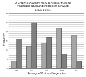
(i) How many adults and children combine eat between 6 and 10 servings of fruit and vegetables per week?
(ii) What is the mode for the number of servings of fruit and vegetables eaten per week by adults?
(iii) What is the difference between the number of children who eat over 2020 servings of fruit and vegetables per week and between 66 to 1010 servings of fruit and vegetables per week?
(iv) What basic trend do we notice from the data presented?
Solution:
Given graph shows how many fruits and vegetables adults and children eat per week.
(i) Here, we need to take readings of the two bars showing 6-10 servings per week category. The number of adults who are between 6 and 10 servings per week is a total of 12. The number of children who are between 6 and 10 servings per week is a total of 25.
Therefore, the number of adults and children combined who have between 6 and 10 servings per week is 12 + 25 = 37.
(ii) Simply, we need to locate the bar that represents children eating over 20 servings and the bar that represents children eating between 6 – 10 servings, find the difference between them.
The number of children who eat over 20 servings of fruit and vegetables is 4. The number of children who eat between 6 and 10 servings of fruit and vegetables is 25. Therefore, the difference between the two categories is 25 – 4 = 21
(iii) The mode is the most frequently occurring value. Since this question is about the adults, we do not need to consider the bars for children. All we need to do is see which bar is highest for the adults.
The 16 – 20 bar has the highest length i.e 22. Therefore the mode is 16 – 20 servings.
(iv) The most basic trend we can obtain from the given information is that adults eat more portions of fruit and vegetables per week than children.
FAQs on Bar Graph or Column Graph
1. How do you define a bar graph?
The bar graph represents the categorical data using rectangular bars. It shows a comparison between discrete categories.
2. What are the different types of bar graphs?
The different types of bar graphs are vertical bar graphs, grouped bar graphs, horizontal bar graphs, and stacked bar graphs.
3. Is a Histogram the same as a Bar Graph?
Bar graphs are used when your data is in categories. But histogram is used when the data is continuous.
4. When a bar graph is used?
The bar graph is used to compare the items between different groups over time. These are used to measure the changes over a period of time. When the changes are larger, a bar graph is the best option to represent the data.
<!–
–>